Tuesday, 23 November 2010
Visual Poems.
Still sticking with the typography idea, we've started looking at visual poems. Which is basically starting out with a poem and creating a picture out of the words in the poem. It can be difficult at sometimes, and with mine they always seem to be time consuming. I'll post some outcomes once I've got stuck in.
CHRISTMAS!
I made this village with 2 other people from my class. We had 6 hours and we just thought LETS MAKE CHRISTMAS, so this is what we came up with! It started as typography and we just developed it from there, the quote which we built the town around is in the river.
Broken Space.
This piece just sort of happened, I didn't really think about it to much and just decided that I was happy with this to be my final piece. I created it from balsa wood and tiny pins for the spikes. I just think that all the disjointed angles and sense of danger with the pins gives it the feeling of a broken space. Not bad for 6 hours work, considering it is pinned together, with a little help from some glue.
Broken Space.
We were given a theme of Broken space to explore in the 2 week 3D workshop. It involved making things then destroying them in anyway possible, along with some development work to show exactly what you were planning to do.
This is just a cube of plaster which I crushed in a vice. I just really liked the way it turned out, and as soon as i let go the whole thing just fell apart. Some of the features in this influenced the final sculpture I designed.
FIRE! Setting fire to aluminium mesh doesn't really do anything. The mesh liquefies a little so that it becomes warped with the movement of the blow torch. The flames you see here is just the glue holding it in shape.
Wednesday, 10 November 2010
Paintings
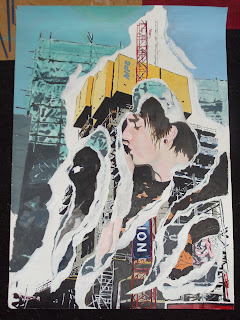
These paintings are from 2 years ago. The top one was inspired by David Hockney, it was the first large painting I had ever done, and definitely the first painting of a person I had ever done. The bottom one was inspired by Mimo Rotella and the entire painting has a posterized effect which explains the block colours.
Scary Lady
This did not go as intended. The proportions are all over the place but the dark wash over the top just gives it a really eerie feel.
Ink and Water
Using black indian ink and water I created these quick drawings. I like the effect of the ink and it's something that I really enjoy working with.
Twiggy
A drawing of Twiggy I did for my art history. We were discussing fashion photography and this image by Barry Lategan was something that we looked at. Taken in 1966, she really became an icon with her boyish hair cut and dramatic eyelashes giving her a striking look people tried to imitate.
I will try and take a better quality photograph soon.
Aspirations
I've created this space so I can show you all my art work. I am currently studying for my Pre Degree Art and Design foundation year and I'm having so much fun! Hopefully, by the end of it I'll be accepted to the university I really want to go to(Northumbria) and have more chance of making it in the design industry.
Showing people my work is a first for me, I tend to be quite secretive, but it's about time you all got to see something.
Showing people my work is a first for me, I tend to be quite secretive, but it's about time you all got to see something.
Subscribe to:
Comments (Atom)


